Zes Mobile App: Designing Clarity for Electric Journeys
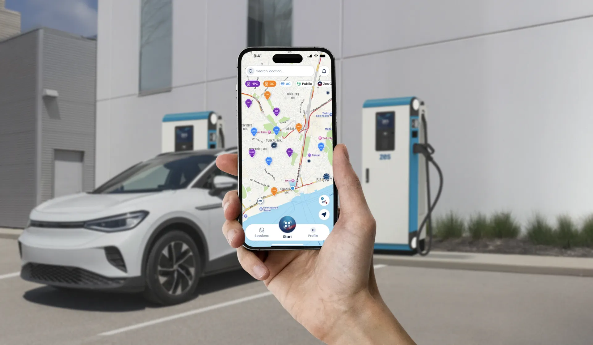
Drivers didn't want more features. They wanted to feel certain.
Türkiye's leading EV charging network came to us with a problem that no feature list could solve. Business metrics like uptime, occupancy and reliability looked healthy. Yet drivers still hesitated at the station, second-guessed the app, and called support for things the interface should have answered.
The real brief, once we named it, was simple: design understanding into the experience. Make every step of an electric journey answer the driver's only real question, "what happens next?"
Naming the real brief
We reframed the objective before touching a single screen. The goal was not to add features. It was to design certainty. That single sentence set the hierarchy for the entire product: every screen, every state, every notification was judged by whether it made the next step obvious.
From that objective came three design principles the whole engagement would answer to: clarity at the station, completion without support calls, and confidence before the first plug. Organizationally, it also meant something bigger. Zes needed a way to see business metrics and experience metrics as one system, so we committed to building that framework alongside the product itself.
At the stations, not the desk
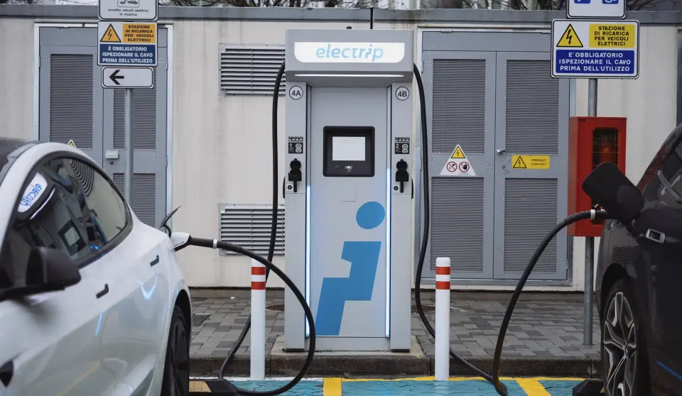
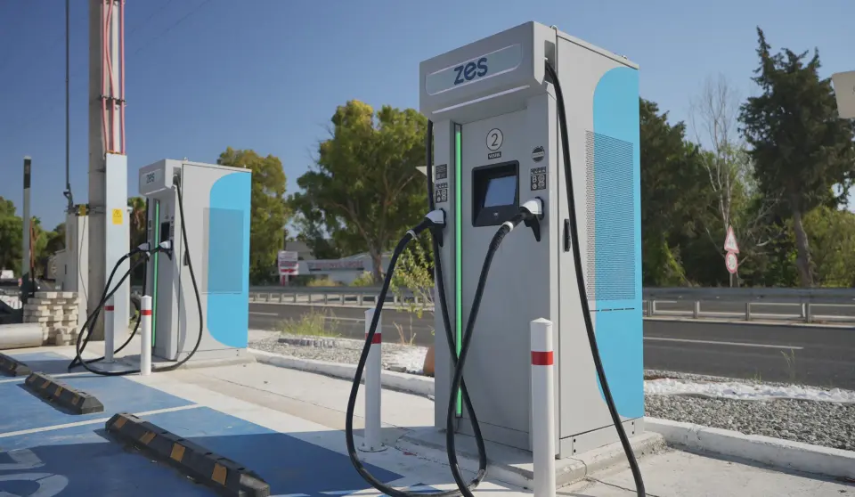
Field research at charging stations. Behavioural analytics across the live app. Stakeholder interviews, call center analyses and user mapping sessions with drivers at every stage of EV adoption, from first-charge anxiety to fleet-level routine. The pattern was consistent: hesitation clustered at the same moments, and none of them were where the team expected.
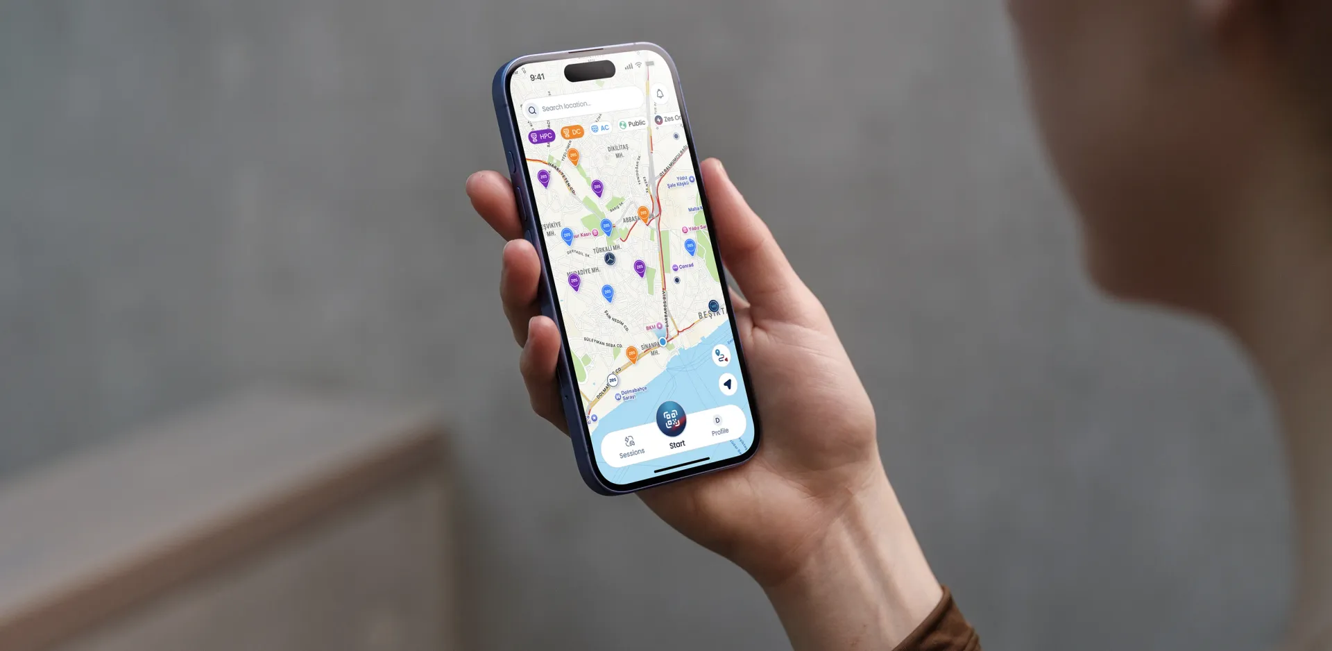 field research and journey mapping for the Zes app
One continuous flow
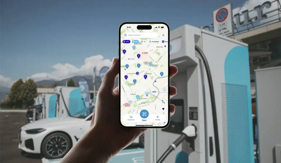
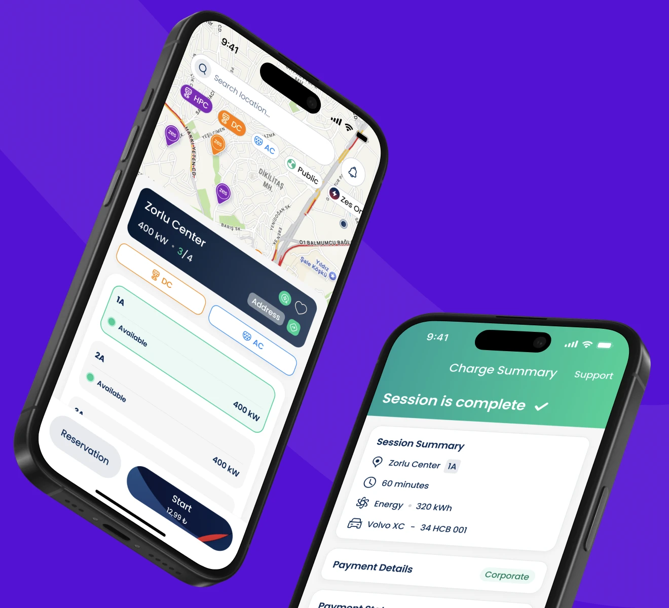
We rebuilt the journey around moment ownership: map, session, payment and history designed as one continuous flow instead of four separate features. The design system born here was deliberately larger than the app, because we knew where this was going. It later carried the website and the kiosk without redrawing a single component.
Each finding got a direct design answer. Fragmented information became explicit feedback on every action, with the interface communicating state as clearly as status. The perception gap became a reassurance layer: microcopy, motion and color that convey confidence before error, with no silent failures. Disconnected data flows became a shared practice, where every friction point in the logs turned into a validation checkpoint during design.
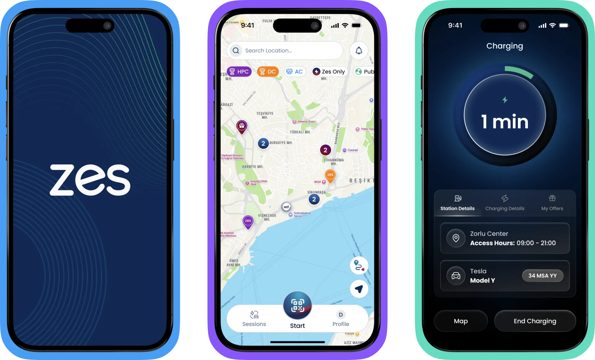 the redesigned journey: find, plug, charge, pay as one continuous flow
One picture of health
We built an experience metric framework that put uptime, occupancy and reliability on the same dashboard as clarity, completion and confidence. For the first time, the organisation could see business health and experience health as one picture, tracked continuously on the live product through call center logs and app analytics.
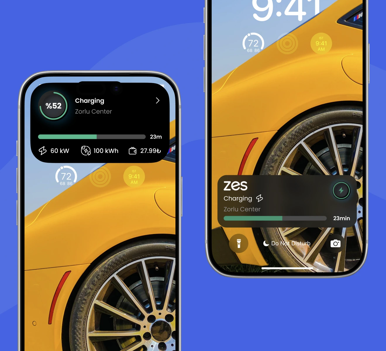
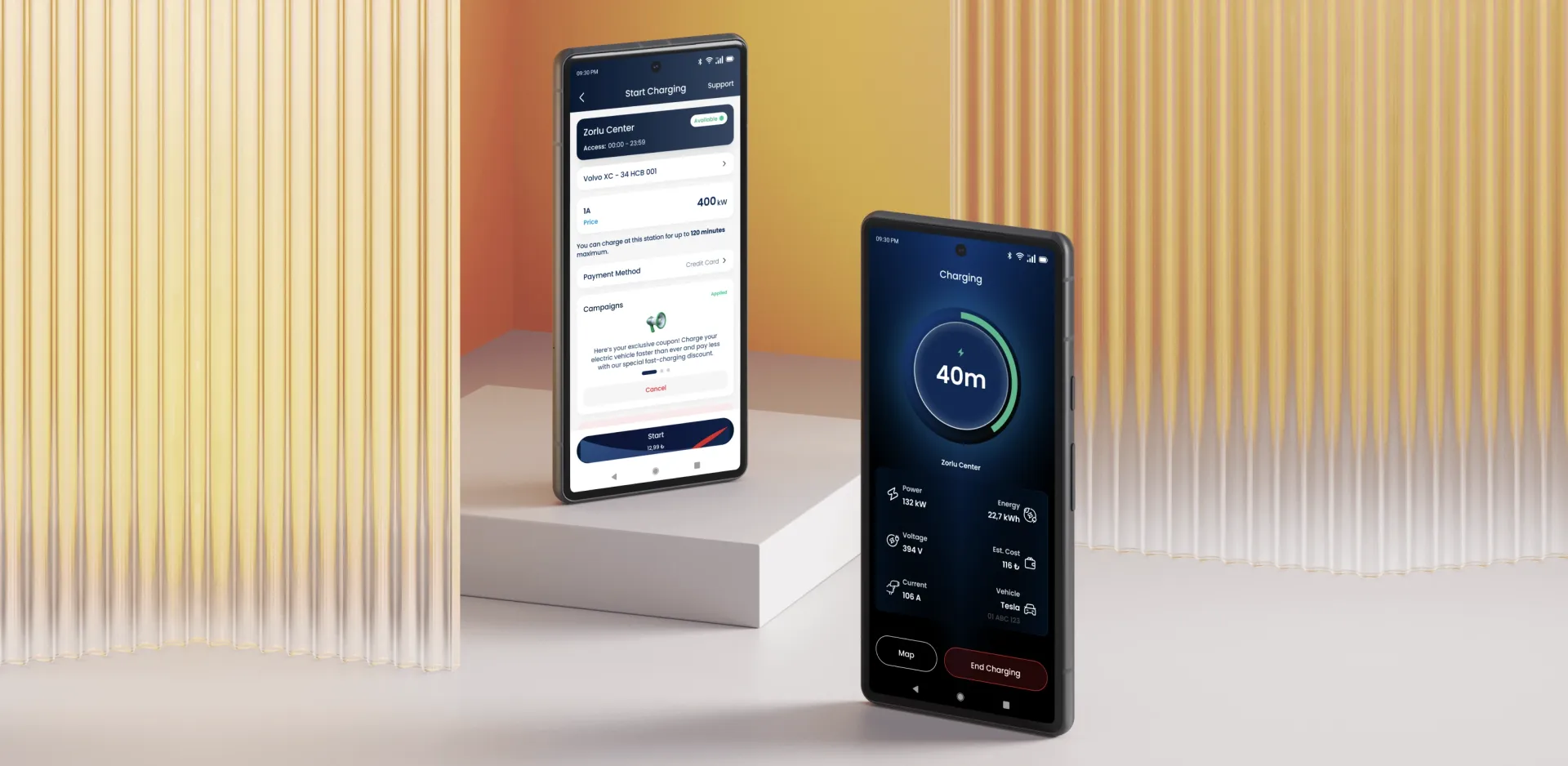 session reliability: progress narrated in real time
The loop never closed
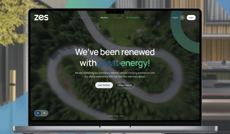
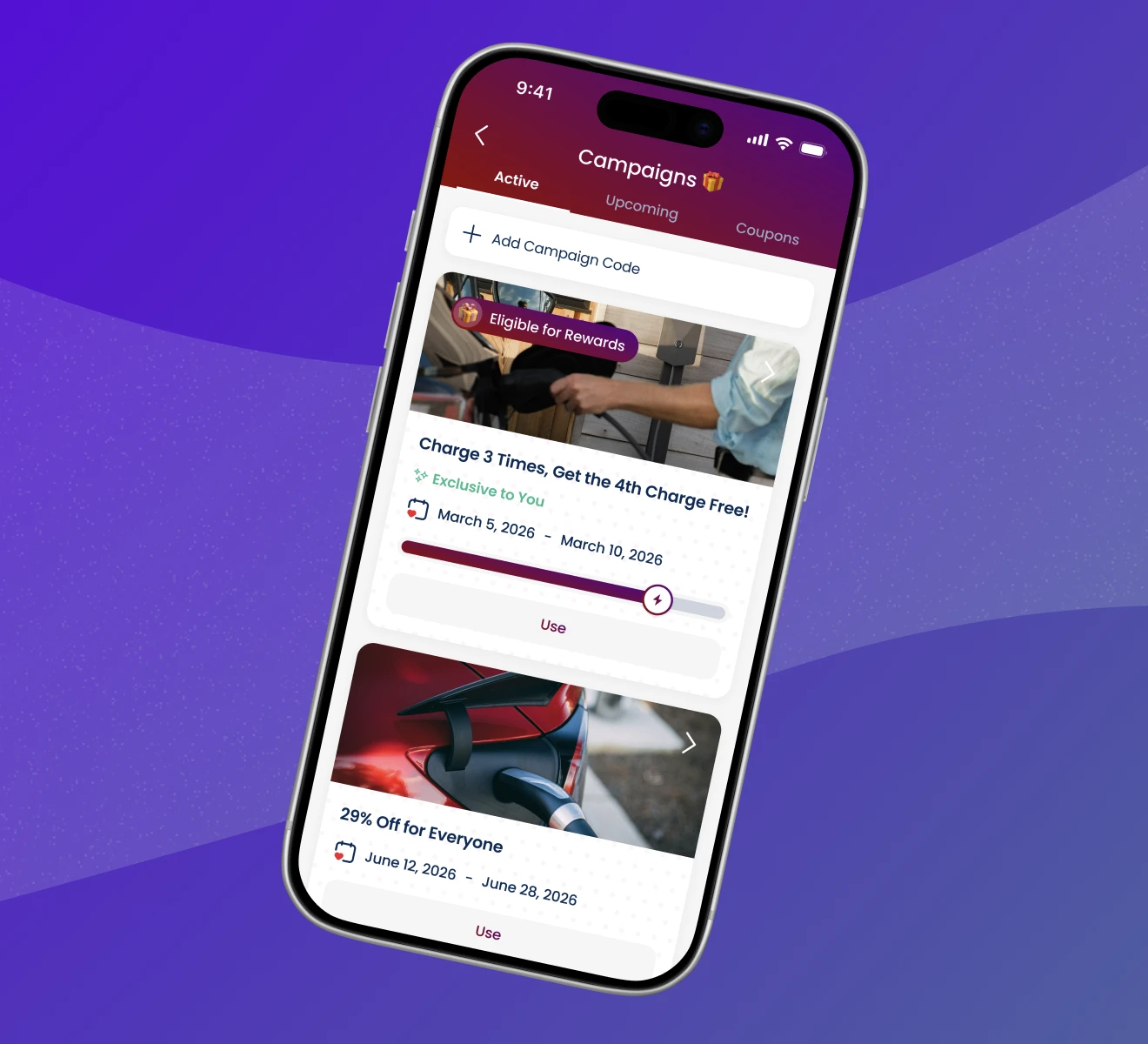
The relationship kept compounding. The Snake loyalty game shipped inside the app and became a habit of its own. The kiosk interface reached stations across the country. The website brought the whole network under the same experience language. Four products, one loop, still turning.
The Snake game deserves its own sentence. It ships as an embedded module, so it never touched the core codebase. Streaks bring drivers back between sessions, and what began as an experiment is now part of the app's retention infrastructure: 700,000+ drivers play Snake while they charge. It became the flagship case of our Loyalty & Retention Design work.
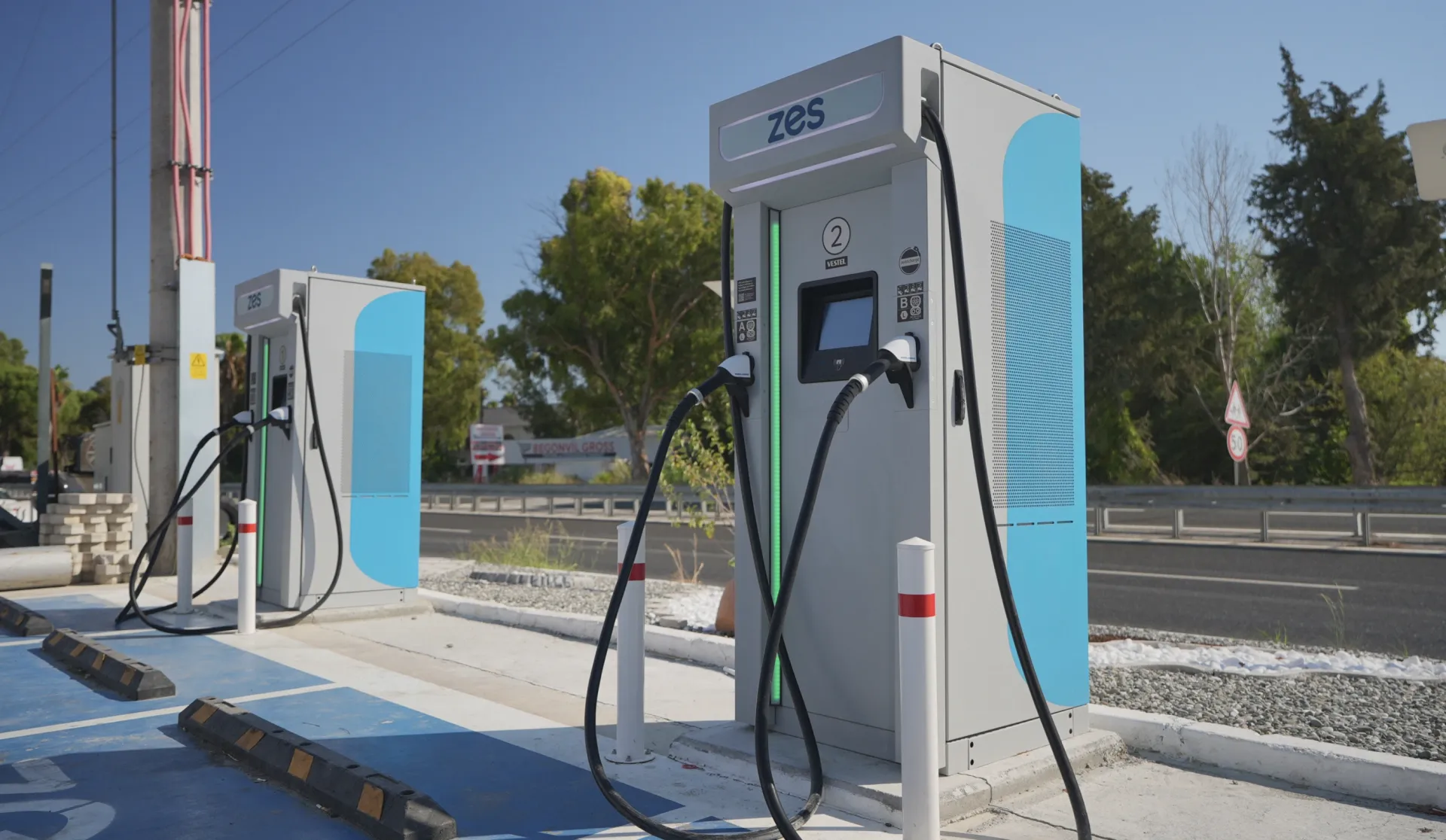 the same system, carried to the kiosk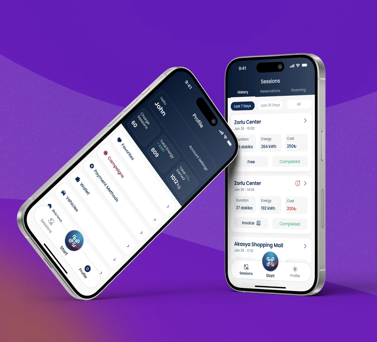
"For three years, blurple has worked like a department of our own. The mobile app, the kiosks in the field, our website: the experience of all of it lives on their table. They feed us innovation, they turn around fast, and they never bring us a problem without a solution attached."

 NEXT CASEZes Kiosk→Zero-instruction interface, deployed across the national network.