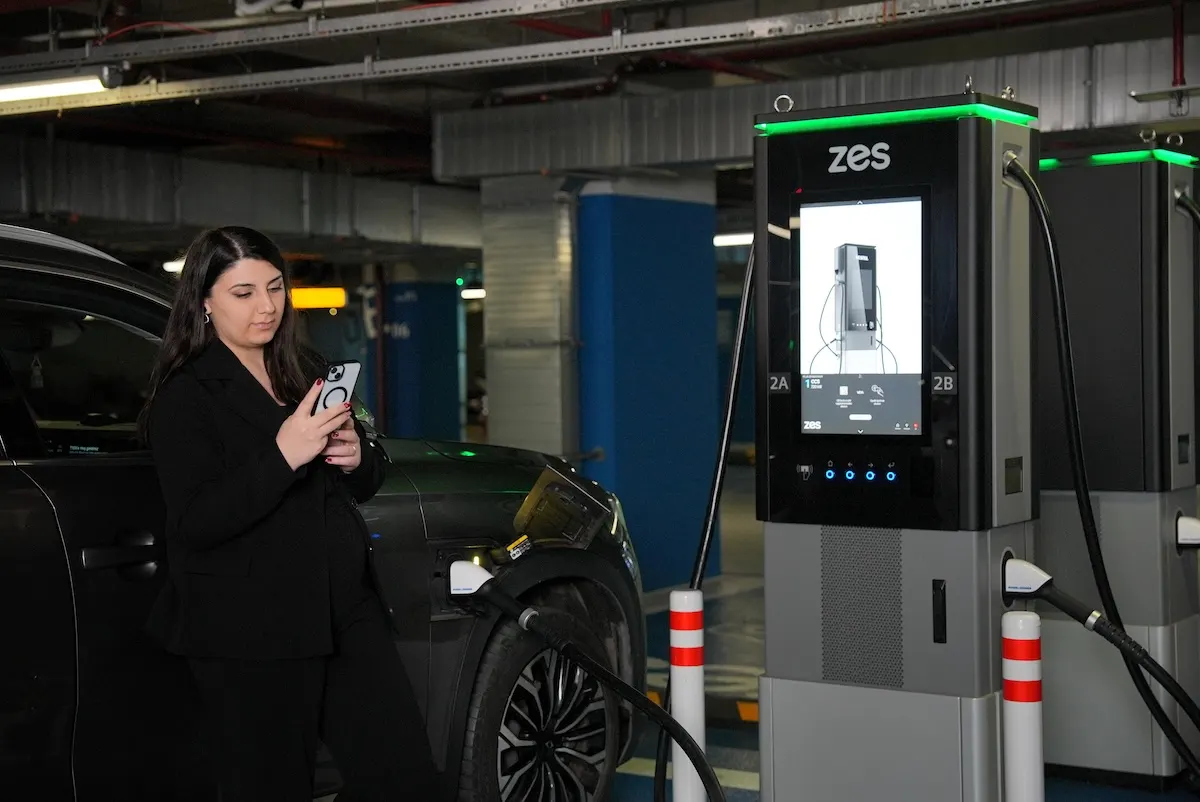
Every screen measured, then tested in the field.
We assessed the interface against accessibility standards (WCAG 2.1, and EN 301 549 for kiosks) and Nielsen Norman Group's usability methods, then tested it in the field with real drivers.
Accessibility
WCAG 2.1 · EN 301 549- Contrast and daylight11:1 to 14:1 contrast on body text, 21:1 on alert cards; measured from the screens.11–21:1
- Touch targetsLarge, well-separated targets; the first tap lands in the right place.80+
- Reading distanceType sizes chosen to be read standing beside the car.80+
- Colour blindnessNo state is shown by colour alone; an icon and text always come with it.80+
- Reach heightControls within reach of a wheelchair user.80+
- Blind and low-vision useWith spoken guidance, the flow can be followed without sight.80+
- Languages19 languages, for drivers crossing borders.80+
Usability
Nielsen · NN/g methods- Heuristic evaluationEvery screen reviewed against Nielsen's 10 usability heuristics.80+
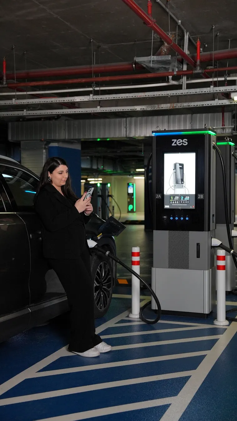
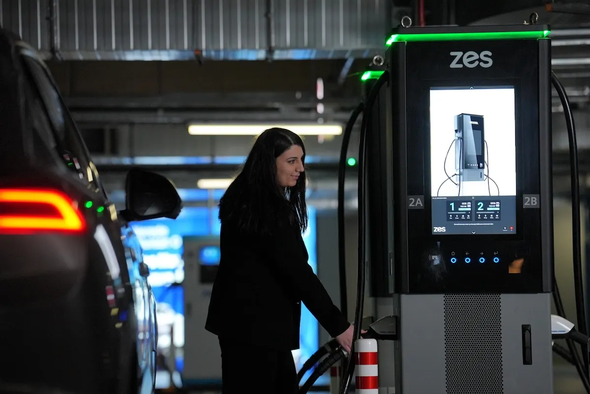
- Field observationReal use observed in different light and settings, with different kinds of drivers.80+
- Usability testingWith 20 participants, on real tasks.80+
- Task success and timeHow many drivers started a charge without help, and how long it took.80+
- Competitor analysisOther networks' station interfaces compared step by step.80+
- Behavioural dataWhere drivers gave up was studied, and the flow simplified with that data.80+
80+: assessment score, out of 100
Every state has its own screen.
An HMI has to explain itself when something goes wrong, not only when all is well. Pick one and it opens on the station.
High power, simple experience.
Zes's HMI couldn't pass the technical complexity of high-power charging on to the driver. It had to be simple enough for drivers of any experience to understand at first glance and start a charge without help. We didn't redesign a screen; we redesigned the experience.
- 01PrincipleThere's no manual at a charging station; the screen has to explain itself. That principle was the starting point for the whole design.
- 02FieldWe observed how the interface is used in different physical settings and by different drivers; behavioural data showed the main points of friction.
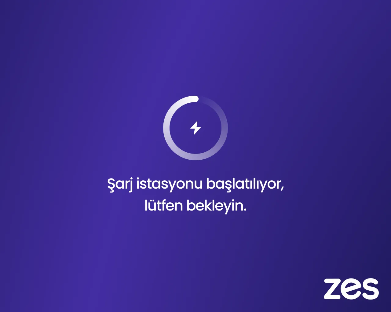
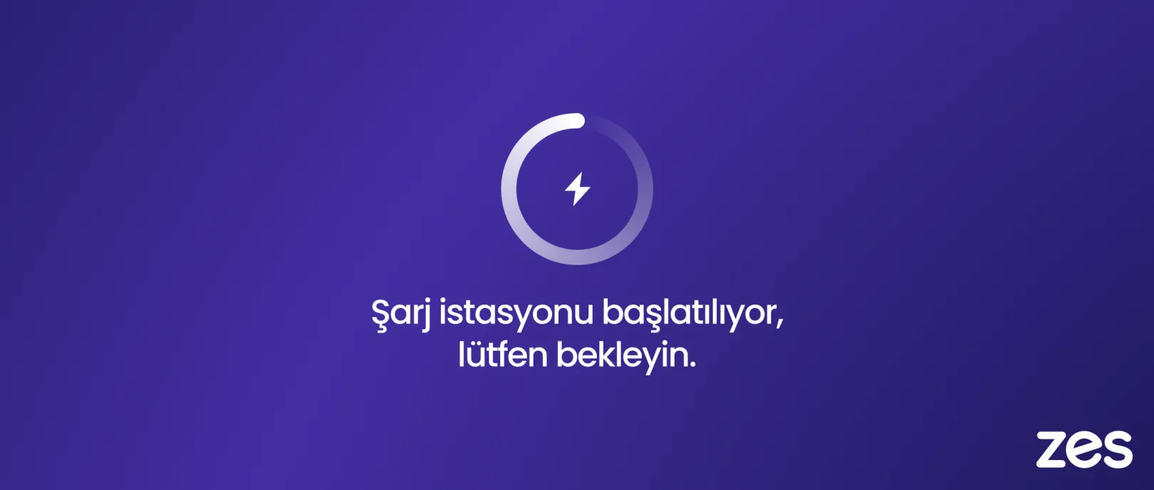
- 03FlowStarting a charge came down to four clear stages, one decision each.
- 04TestingThe design was tested in real field conditions with 20 participants, and the flow kept improving with the data.
One HMI family, two networks, seven countries.
We did the same work for Electrip, part of the same group as Zes. The interface welcomes drivers at Zes stations in Türkiye and at Electrip stations across Europe.
The real experience is on the street. Come and try it.
This HMI runs on Zes's high-power (HPC) charging stations. Find the nearest one on Zes's map, and try the same screens beside a car, in daylight.