Is your hotel site EAA-ready? A checklist for the booking path
What a hotel team should check, in the order a guest meets the pages: the date picker, room pages, the booking step, the booking engine, phones and the accessibility statement. With a test you can run in an afternoon.
We scanned the booking sites of 98 hotel groups and chains, and 94% of the ones we could test had serious accessibility barriers, the booking step included (the study). This is the checklist we'd give a hotel team, in the order a guest meets the pages: from the search box on the home page to the confirmation email.
Before you start: does the EAA apply to you?
- Selling rooms online is e-commerce. If guests in the EU can book a room on your own site or app, the European Accessibility Act covers that service, wherever the hotel is. A hotel in Antalya or Bodrum selling to a guest from Germany is in scope.
- Microenterprises are exempt. That means fewer than ten people and no more than €2 million in turnover or balance sheet. A hotel group usually isn't one.
- The yardstick is EN 301 549, which for websites means WCAG 2.1 level AA.
- This is a working list, not legal advice. If you're unsure about scope or transition periods, ask your lawyer.
1. The home page and the search box
The first thing a guest does is choose dates. On many sites, that's where a screen reader user gets stuck.
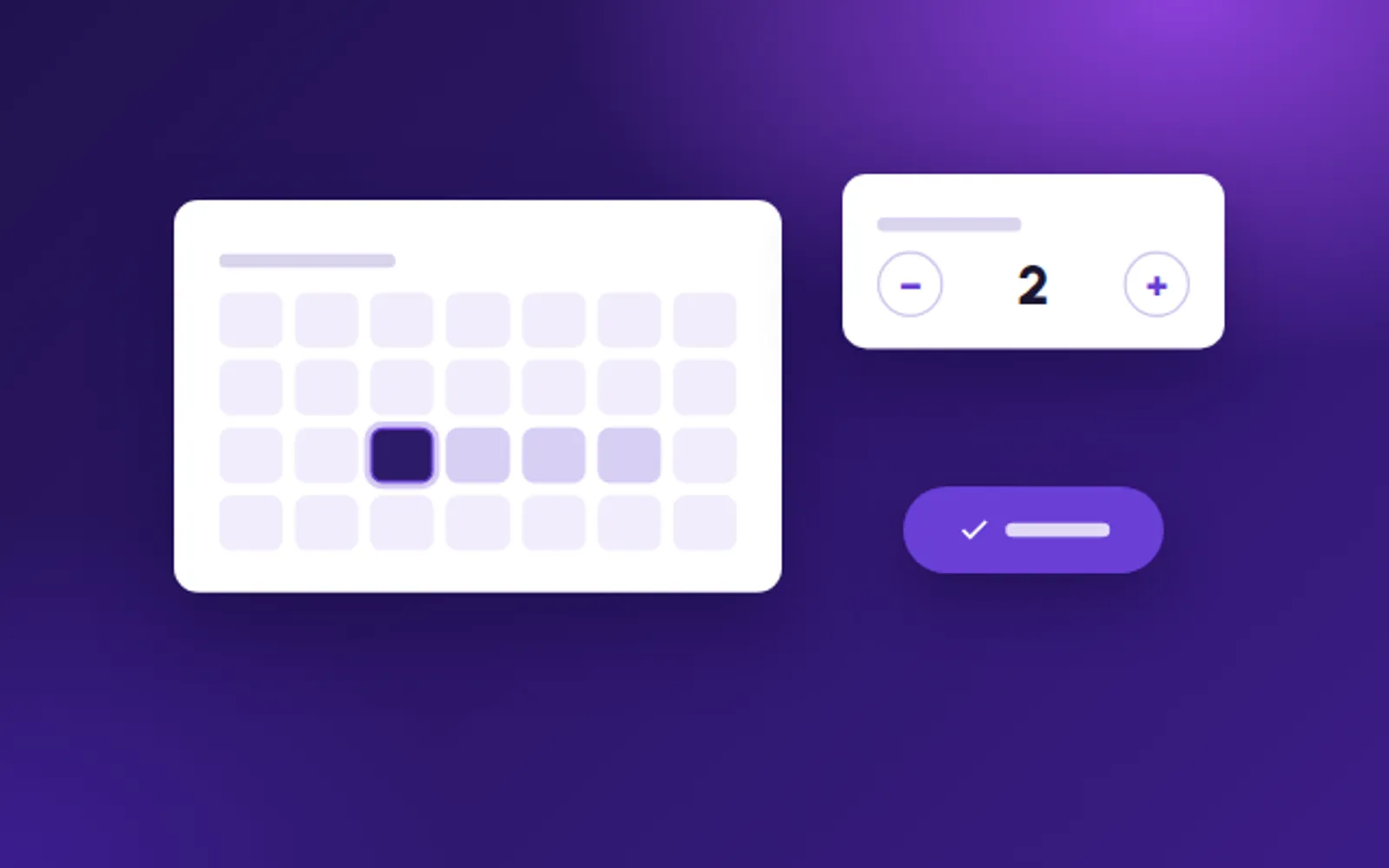
- Date pickers. Every day in the calendar is a button with a name a screen reader can say, such as "15 October, available". The calendar works with the arrow keys, and the guest can also type the dates.
- Guest and room counters. The + and − buttons have names ("Add an adult"), and the new number is announced when it changes.
- The search button is a real button with visible text, not an icon in a div.
- The cookie banner can be closed with the keyboard, doesn't trap focus and doesn't hide the element in focus.
- Text on photos. Headlines and offers over a hero photo need a contrast of at least 4.5:1. A dark overlay behind the text usually solves it.
- Pop-ups and offers can be closed with the keyboard and the Escape key, and focus returns to where the guest was.
2. Room pages
- Photo galleries. Each photo has a text alternative that says what it shows: a sea-view balcony, a walk-in shower, two single beds. That's how a blind guest compares rooms. The arrows are buttons with names, and the gallery doesn't move on by itself, or it can be paused.
- Room facts in text, not only as icons: size, beds, view, bathroom.
- Accessible rooms, described precisely. Step-free access, a roll-in shower, grab rails, door widths. That's physical accessibility, which the EAA doesn't cover, but it's exactly what guests with disabilities look for before they book.
- Prices make sense when read aloud. A crossed-out price says so in text ("was €180, now €150"), and what's included is written next to it, not only in a tooltip.
3. The booking step
- Every field has a visible label. Placeholder text that disappears when you type isn't a label.
- Errors say which field and how to fix it, not only with red, and focus moves to the error so a screen reader user hears it.
- Time limits. If the session or a price hold expires, warn the guest before it does and let them ask for more time.
- Don't ask twice. If the guest has already entered something, such as their email, fill it in for them later in the flow (a WCAG 2.2 rule worth meeting now).
- CAPTCHAs. Offer a way through that doesn't depend on seeing an image or solving a puzzle (WCAG 2.2).
- Payment. The card form is often a frame from your payment provider. Test it too: it needs a title, labelled fields and readable errors.
- Confirmation. The booking number and the details on the confirmation page and in the email are text, not an image.
4. The booking engine
On many hotel sites, the booking steps are a vendor's product. The guest doesn't know that: to them, it's your hotel.
- Ask for the vendor's accessibility conformance report, against EN 301 549 or WCAG 2.1 AA, and read what it says doesn't work yet.
- Put it in the contract: a target date, a test the vendor has to pass, and who fixes what, how fast.
- Test it with your branding. Your colours on the vendor's templates can fail contrast even when the vendor's own demo passes.
- Treat it as one journey. A guest who moves from your site to the engine shouldn't find a different language setting, a different text size or a focus outline that suddenly disappears.
5. On phones
- Don't block zooming. Remove `user-scalable=no` and `maximum-scale=1` from the page. A quarter of the sites in our scan blocked it.
- Make tap targets big enough. WCAG 2.2 asks for at least 24×24 pixels; we design for 44×44.
- Sticky bars and chat buttons. A "Book now" bar or a chat bubble shouldn't cover the field the guest is typing in.
- Narrow screens. The page works at 320 pixels wide without scrolling sideways.
6. Overlays and the accessibility statement
- Don't rely on an overlay widget. It changes how the page looks for people who find and use it, but it doesn't fix the code a screen reader reads. In our scan, 4 of the 5 sites with an overlay still had serious barriers.
- Publish an accessibility statement and link it in the footer of every page. It should say which standard you follow, what doesn't work yet, how a guest can book another way (phone, email, chat), who to contact and when the statement was last reviewed. In our scan, only 1 of 30 Turkish hotel groups linked one from the home page.
How to test it in an afternoon
- Keyboard only. Unplug the mouse and book a room, from the home page to the payment screen. Can you always see where you are?
- A screen reader. Turn on VoiceOver on an iPhone (Settings → Accessibility) and try to choose your dates.
- Zoom. Zoom the desktop browser to 200%, and set your phone's text size to the largest.
- An automated check. Run axe DevTools, or our free a11y-ray, on the home page, a room page and the booking step. It finds about a third of real barriers: a good start, not the finish line.
Whatever you can't complete, a guest can't either. Start there.
If you'd like to do this with someone who has done it before, that's what our Compliance Check is for. And if you run one of the groups in our study, write to hello@blurple.digital: we'll send you your own results, privately and free of charge.
A short call, and we'll tell you honestly where you stand and what the first step should be.