Ridee: Designing the Complete Micro-Mobility Experience for Istanbul's Electric Car Sharing Platform
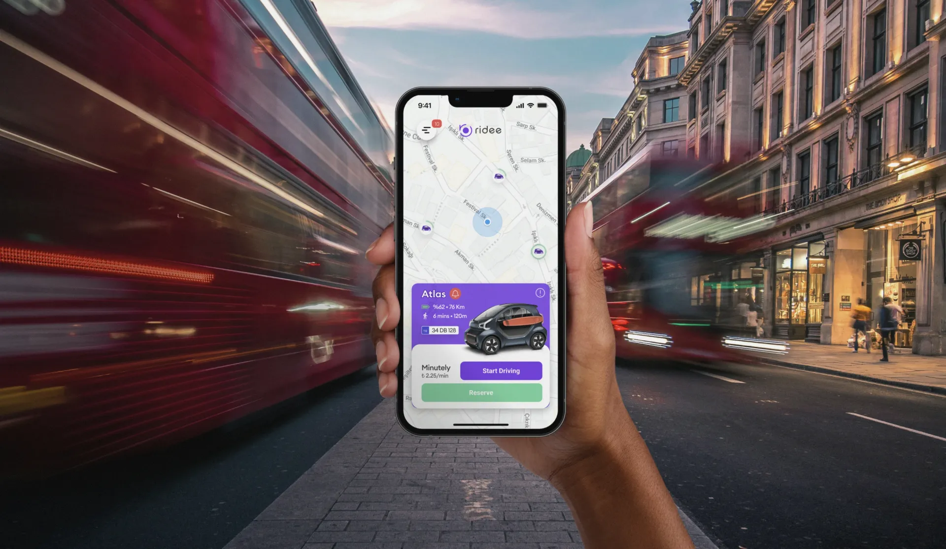
Nobody in Istanbul had rented a 3D-printed electric two-seater before. The app had to make it feel normal.
Ridee put a fleet of XEV Yoyo electric micro vehicles on the streets of Beşiktaş and Sarıyer: Italian-designed, 3D-printed two-seaters with swappable batteries and 150 km of range. Users find the nearest car on a map, drive by the minute, or reserve ahead. No staff, no counter, no handover.
That last part was the brief. Every step, understanding the concept, evaluating a vehicle, driving, parking, paying, had to be solved inside a single app. Every drop-off point in that chain is a user who never takes a trip, and a vehicle that earns nothing.
First trip, no help
The north star was one sentence: a user who has never used a shared electric micro vehicle should be able to complete their first trip without asking anyone for help. Every potential confusion point, what is this vehicle, how do I start it, where can I park it, how do I pay, had to be answered in the product itself, not in documentation or customer support.
Reading the city before the screens
We mapped the urban mobility context of Beşiktaş and Sarıyer: traffic patterns, parking constraints, and the habits of people who might switch from taxis or public transport. The XEV Yoyo's specs, 150 km range, 80 to 90 km/h, battery swapping in minutes, were a genuine advantage. The design had to make them visible and credible without asking anyone to read a spec sheet.
 a new mobility category, mapped to Istanbul streets
The map is the product
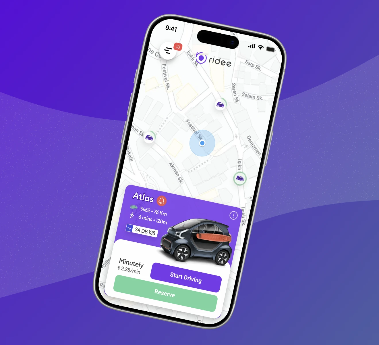
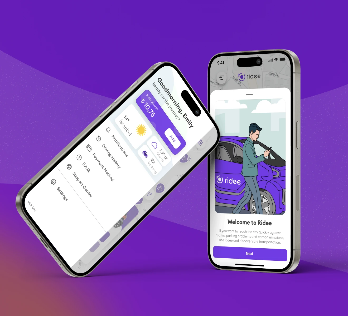
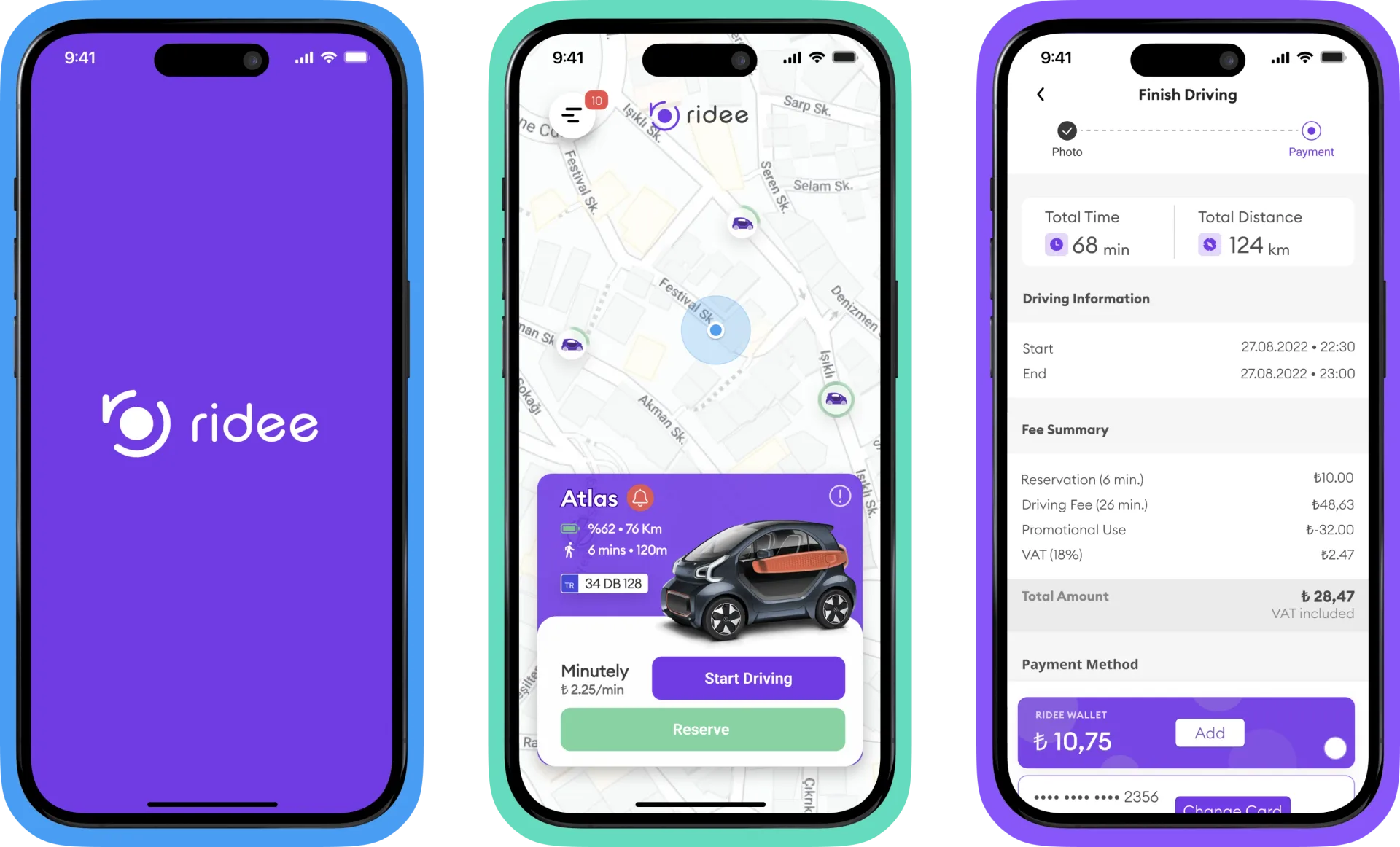
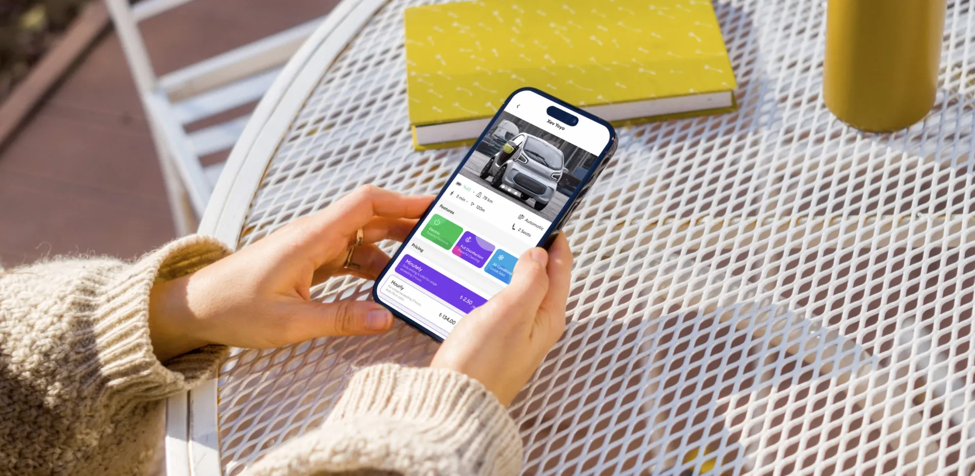
The home screen is a full-bleed map with vehicles at their real-time positions; every flow is a layer on top of it. The cold start became a three-tap illustrated onboarding that sells the eco-mobility idea before the instructions. Vehicle confidence became a bottom-sheet card carrying the full decision set: name, battery percentage, remaining range, walk time and distance, plate, and the per-minute price next to two clear actions, Start Driving and Reserve.
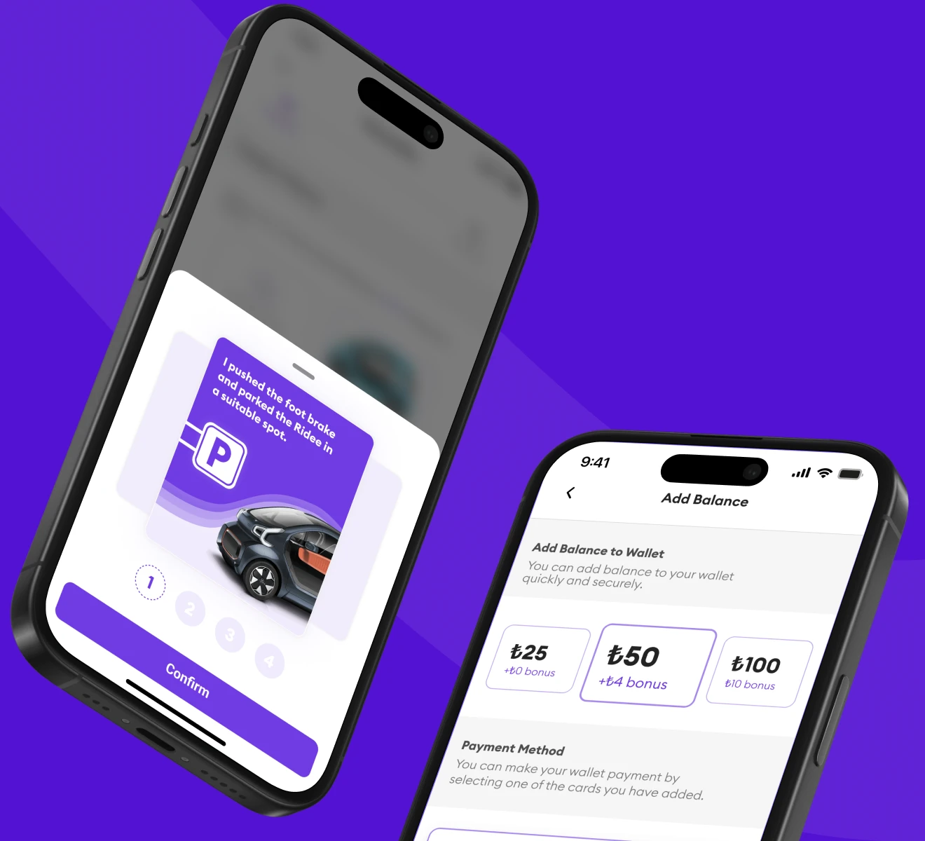
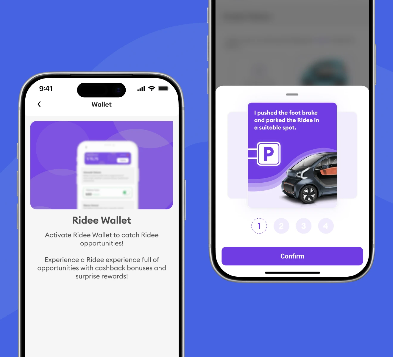
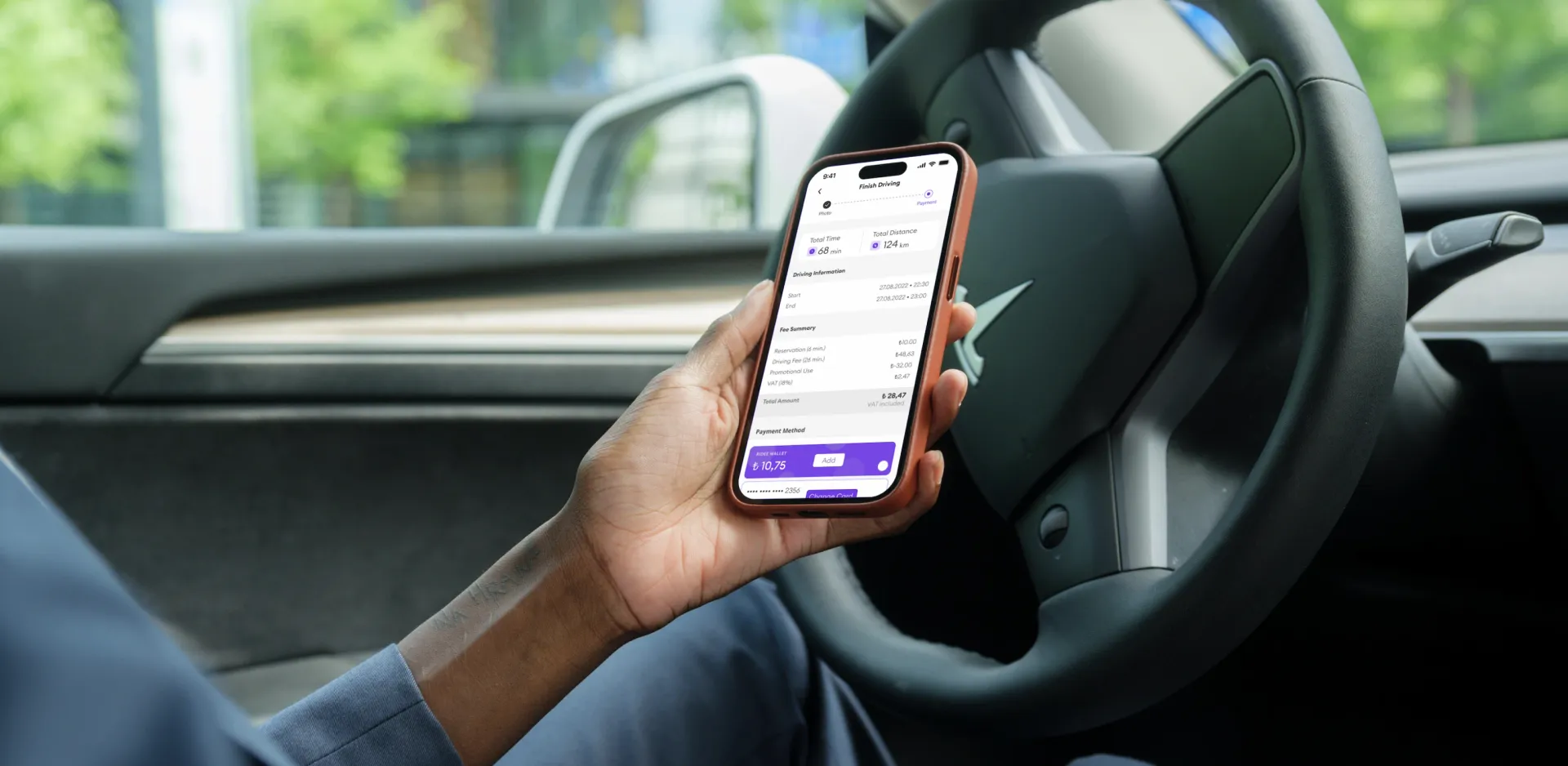
The parking risk became a guided four-step confirmation checklist, illustrated and impossible to skip: the session cannot end until each requirement is confirmed. And the Finish Driving screen shows a fully itemized summary, reservation time, driving time, promotions, VAT, with no hidden number, readable at arm's length from the driver's seat.
 the map as home: vehicles at real-time positions
Three conversion points
Onboarding completion, first trip start rate, and clean trip completion. Each guided flow maps to one of them: the three-tap onboarding protects the first, the full-information vehicle card protects the second, and the un-skippable parking checklist protects the third, a direct answer to a known operational risk.
 guided flows protecting each conversion point
Designed for the second trip
The Ridee Wallet was built into the product from the beginning, not added later: preset top-ups with visible cashback bonuses turn payment into pre-commitment, because a user with balance loaded is far more likely to ride again. The home dashboard makes the switch feel worth it, showing wallet balance, local weather, kilometers driven and CO2 saved. A practical convenience becomes a values-aligned choice.
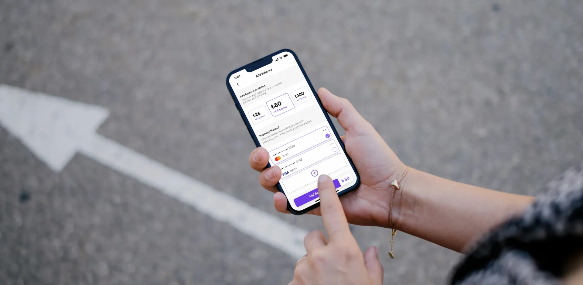 the Ridee Wallet: cashback designed for repeat trips