Beaver: Designing a Hyper-Local Home Improvement Platform for Barcelona
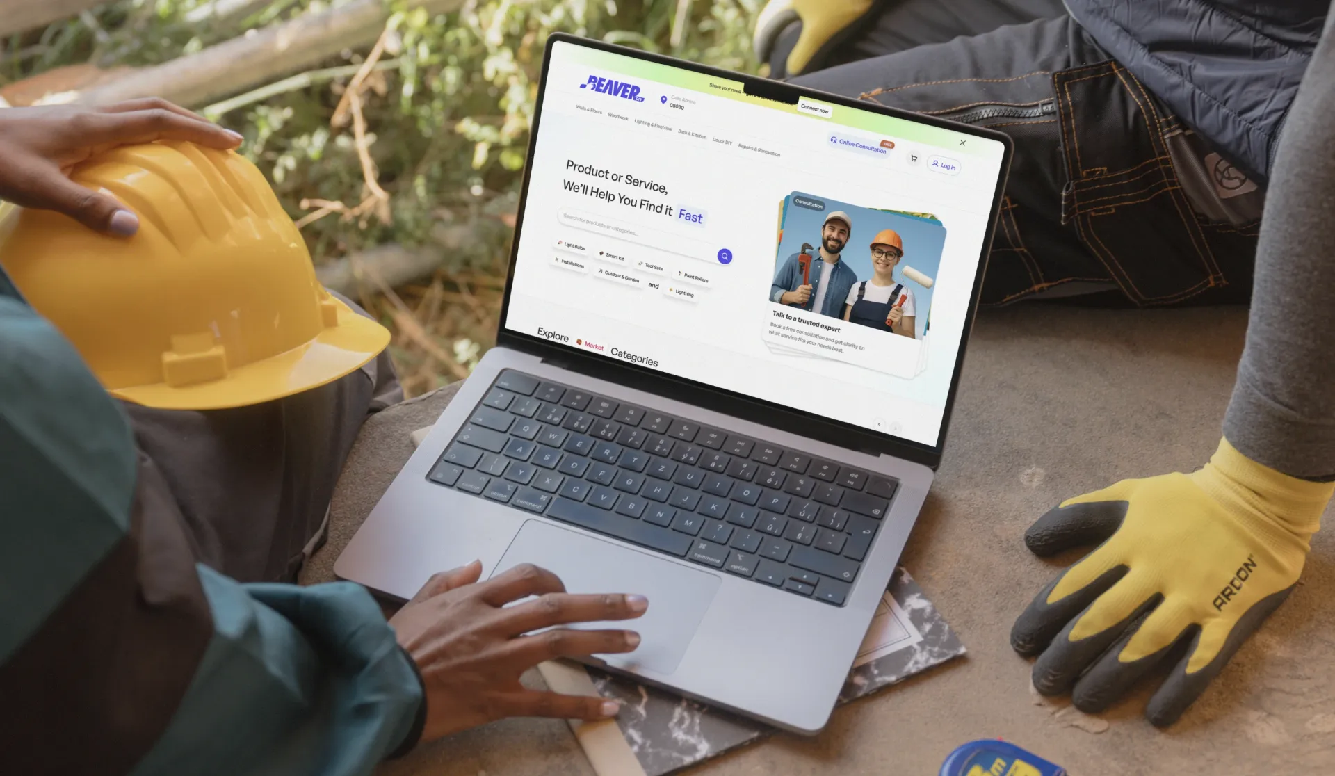
Shopping is browsing. Consultation is trusting. Beaver needed both in one checkout.
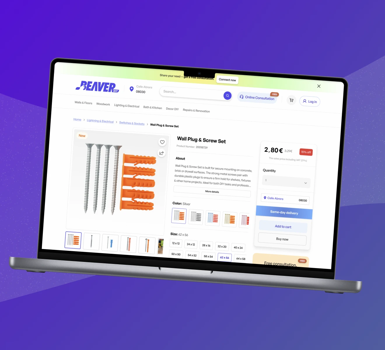
Beaver set out to build a web platform where Barcelona homeowners browse home improvement products, book timed deliveries, and get live video guidance from certified specialists, all in a single unified checkout. The design problem was not the interface. It was orchestrating three fundamentally different service models into one coherent experience.
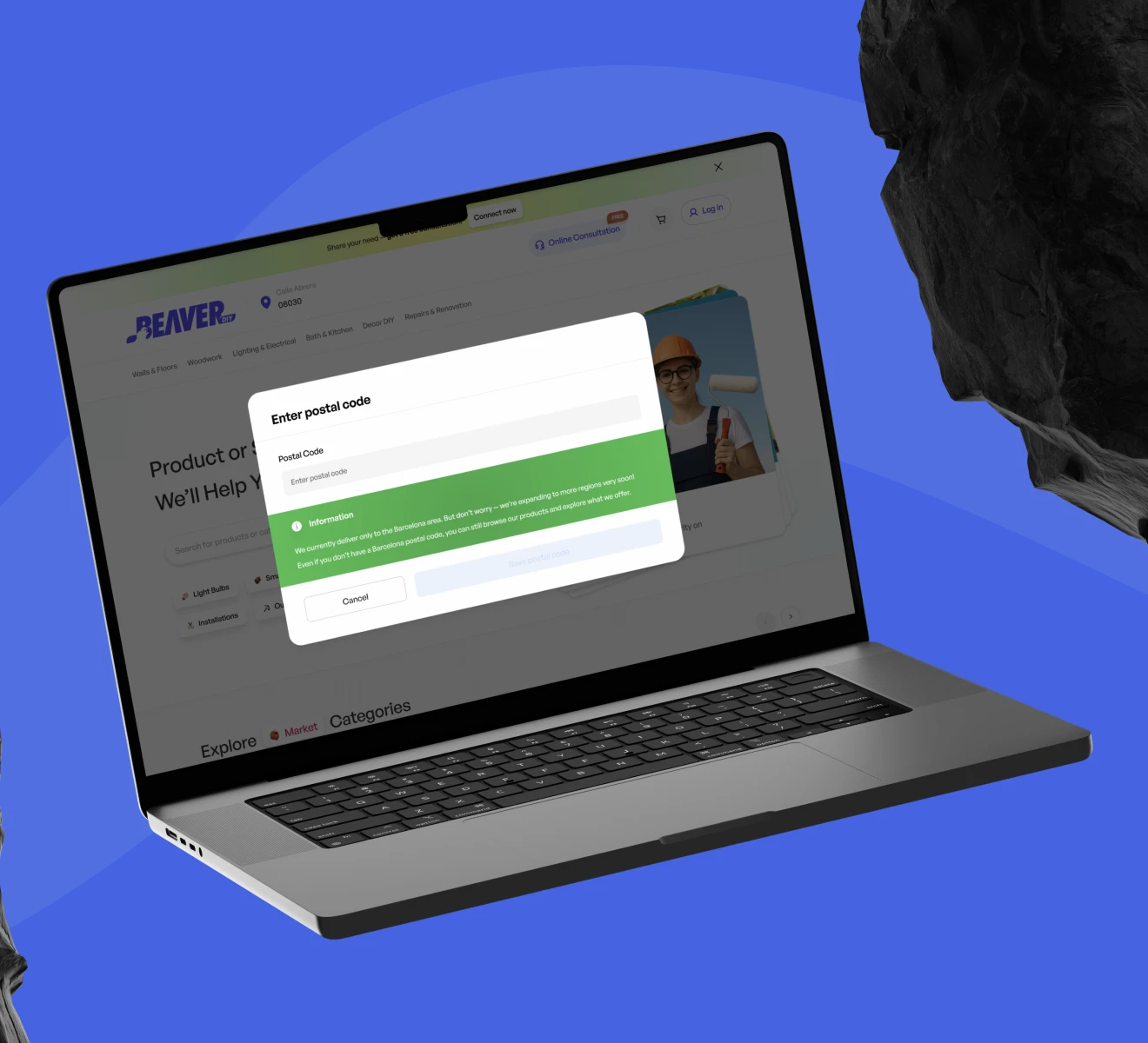
And there was a hard constraint underneath it all: Beaver operates in Barcelona only. Every UX decision had to respect a geographic line without making the platform feel closed.
One question to rule the scope
We aligned the team around a single guiding question: how do you make three fundamentally different services feel like one? Shopping is browsing, comparing, deciding. Consultation is scheduling, committing, trusting. That focus kept the geo-restriction problem from turning into a feature-bloat problem.
Transparency before commitment
We looked at how location-restricted platforms handle out-of-area visitors and how telehealth products build trust before a session. One pattern kept emerging: transparency before commitment. Users accept constraints when they are told early and told honestly.
 mapping the hybrid commerce and consultation journeys
Location first, one cart for everything
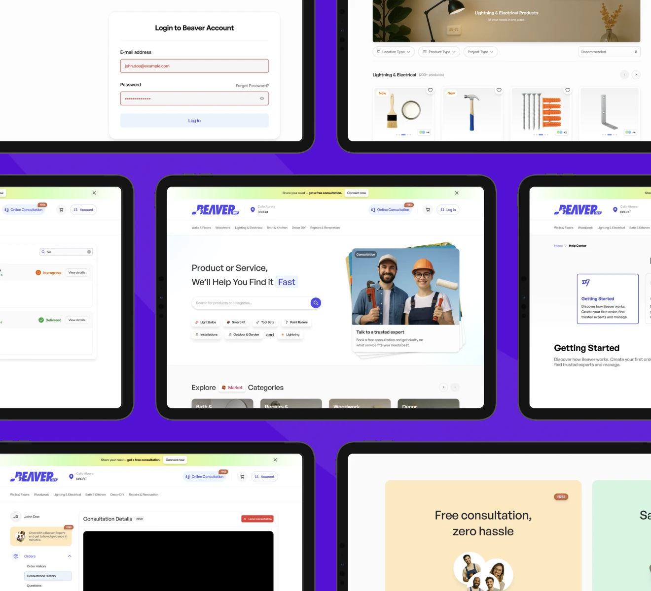
Zip code entry became the platform's first interaction, styled like a search rather than a gate. Barcelona users unlock everything; everyone else gets an honest message and an open catalogue to browse. Context-sensitive CTAs replace disabled buttons, so out-of-area users always know why an action is unavailable.
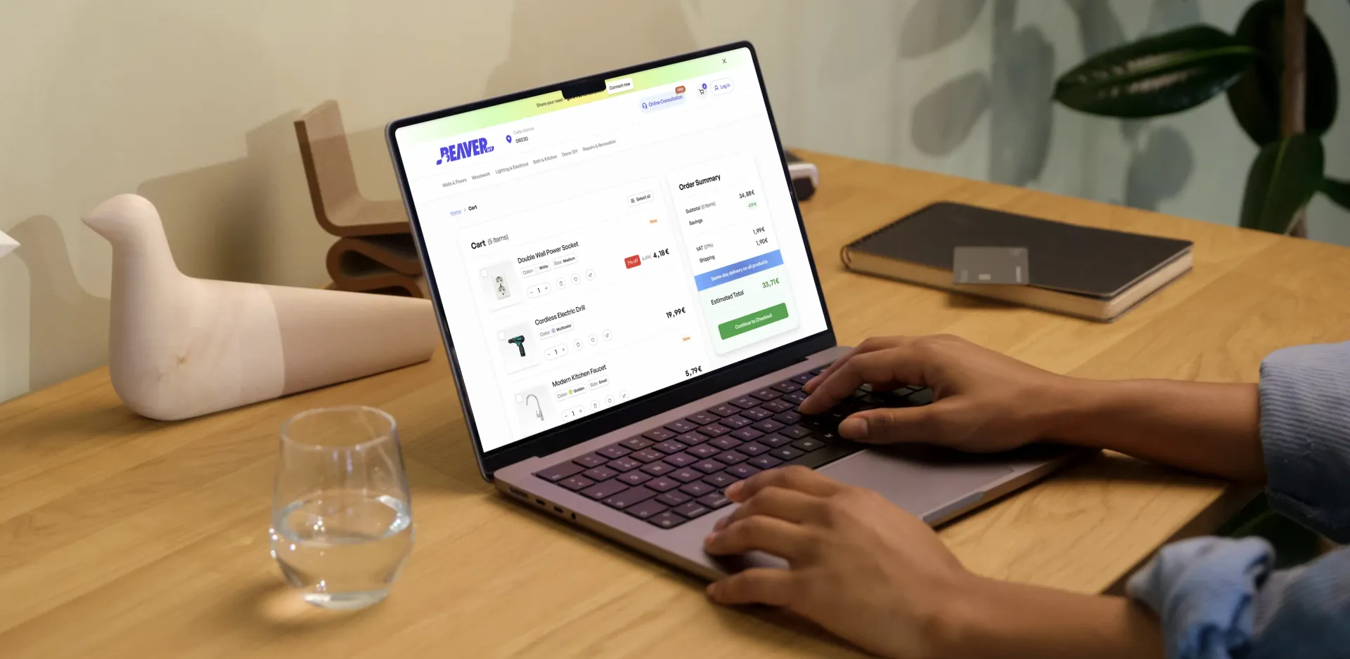
The unified cart became the structural backbone. Products, delivery slots and 30-minute specialist sessions coexist in one cart and one checkout, with mixed item types, date-time dependencies and conditional pricing handled underneath. We mapped every combination a user might attempt, buy only, consult only, or both, and designed one flow that handles all three without branching.
 the unified cart: products, slots and sessions in one checkout
Testing the gate, the slots, the mix
High-fidelity prototypes put the zip code gate, the calendar-style slot selector and the mixed-item checkout in front of users. The assumption under test: that location transparency increases, not decreases, conversion intent among in-area users. Full delivery slots are greyed out and auto-removed, communicating capacity as a planning feature rather than a restriction.
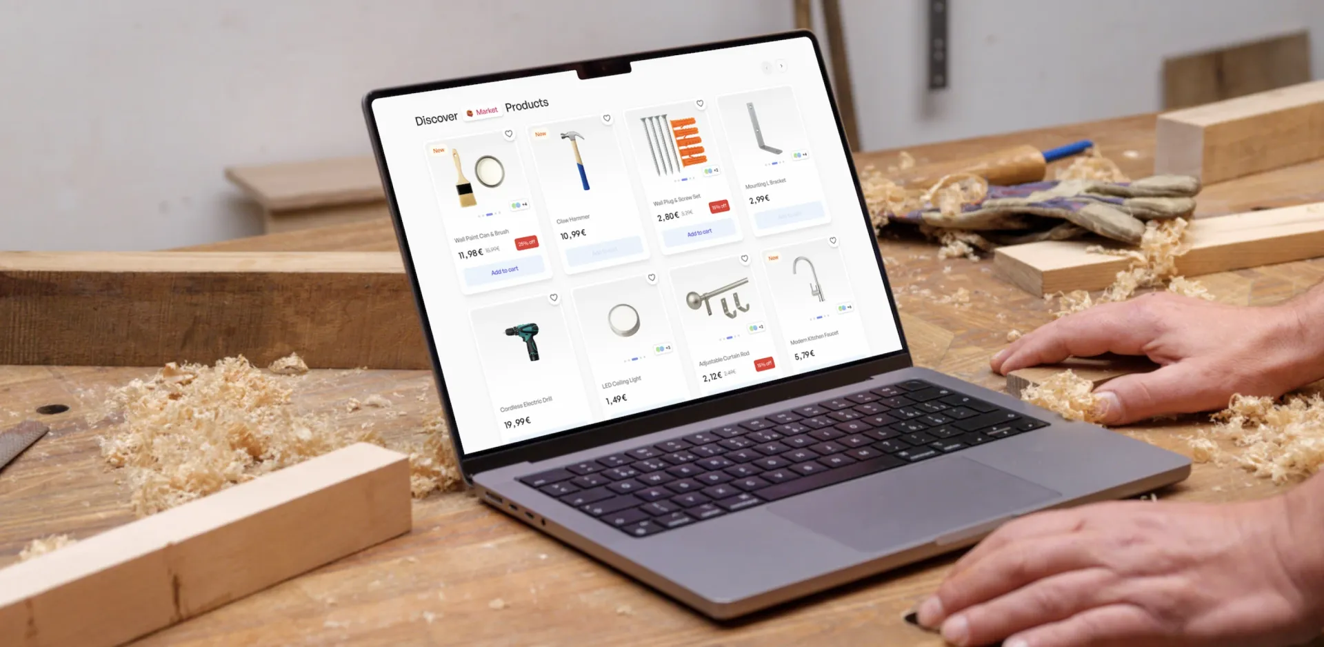 slot-based checkout, tested in high-fidelity prototypes
A loop that closes after the call
After a session, the specialist sends product recommendations straight into the user's account: pre-approved, trusted, purchasable in one tap. Advice becomes action without a hard sell, and every consultation becomes a potential conversion.
The design system was built to scale beyond the first market: new product categories, new service types and future cities can be added without redesigning the core interaction model.
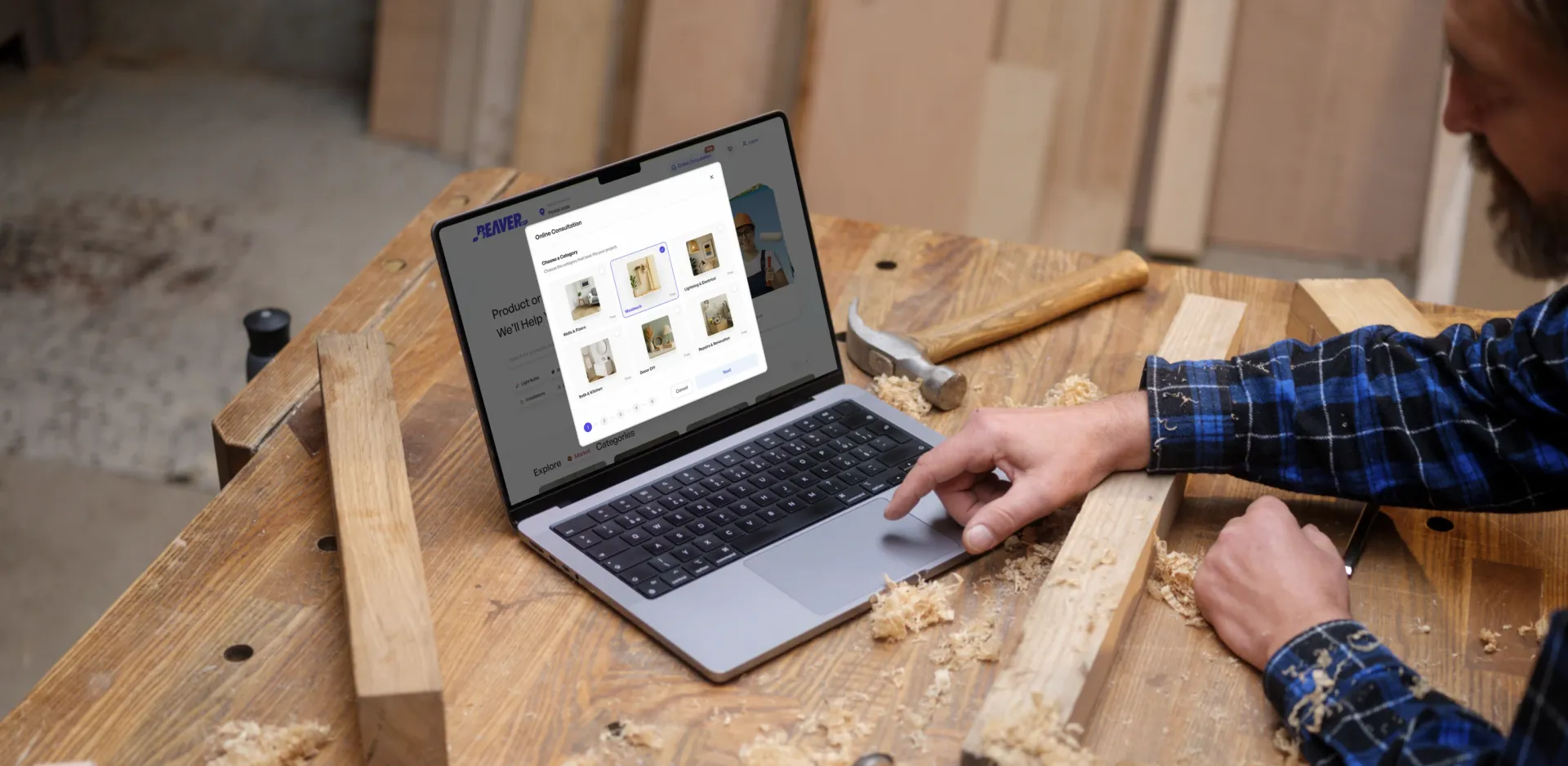 post-consultation recommendations, purchasable in one tap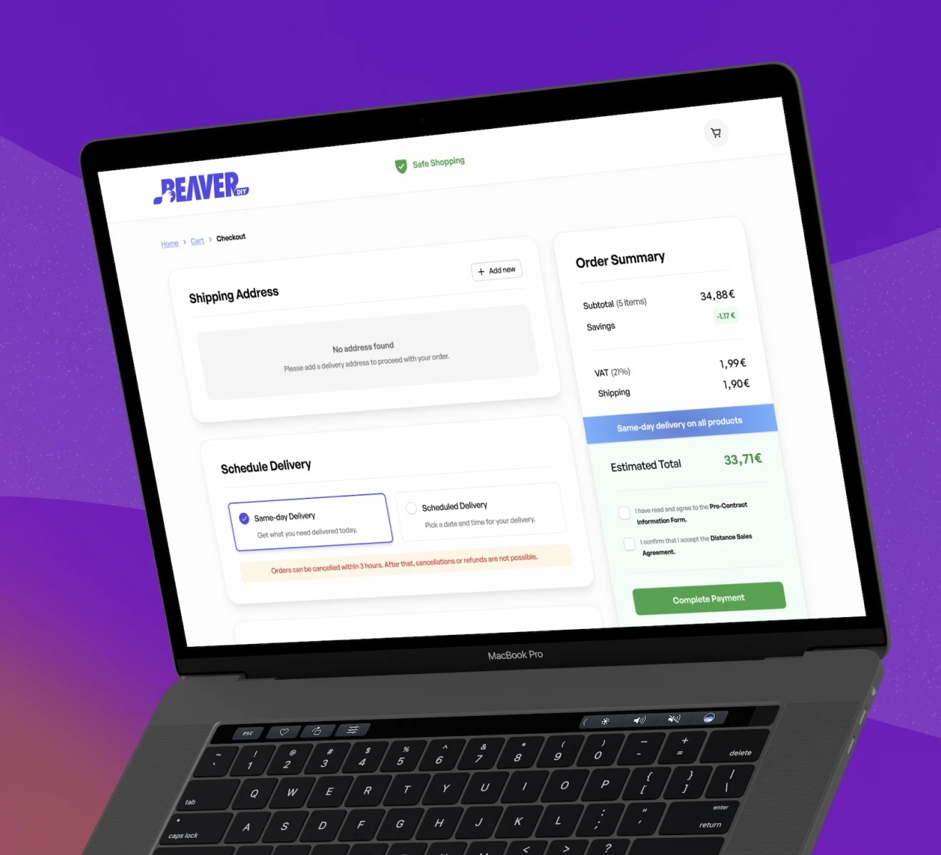
"I am extremely happy with the work that was delivered."